How to Compare Mobile Phones (to Each Other, or to Washing Machines, or … )

Smartphone comparison

Having recently been freed from my two-year cell phone contract, I’ve been casting about for a new provider and new smartphone pocket computer with incidental voice communication function. I don’t talk out of my mouth hole all that much, see, so paying for unlimited minutes seems like a waste. Even my data allowance need not be huge, as I’m usually within the loving embrace of a familiar WiFi signal.

My money is best spent, then, on a powerhouse of a device, with plenty of processing speed and memory and fancy features. I prefer Android; a good camera is a must; and it must be small enough to fit into the side pocket of all the carpenter jeans in which I’ve invested. And because I don’t want another contract, an “unlocked” phone compatible with my chosen network is essential.

To compare smartphones, a bevy of websites are available, each with their own positive and negative aspects. Of course there are your favorite shopping sites and price comparison engines, but they tend to have a bias toward the same phones available at the major carriers’ own sites. For unlocked phones, specialty sites are the place to go.

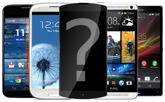
Depending on your level of patience with tickboxes and dropdown menus, WhistleOut, PhoneScoopPhoneArena, or GSMArena should point you toward reasonable candidates. WhistleOut and PhoneScoop let you compare the copious details of five phones side by side; PhoneArena is limited to three. GSMArena does have a compare feature, but not accessible directly from the results of your search and only for two phones at a time.

Phone comparisons

It can get a little complicated.

If you just want to pick from prominent phones, Geekaphone is your prettiest option. With giant pictures, room for five models, and a few benchmarks expressed in graph form, it’s almost fit for posterization. On the other hand, Compare Cell Phones spells out the advantages of each of two models in a compact list.

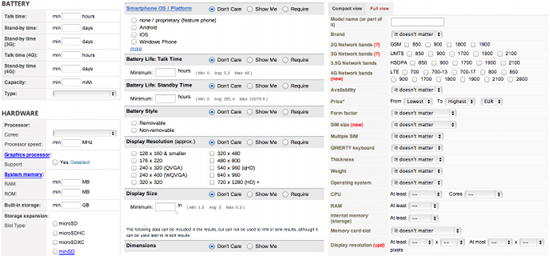
The real masterpiece, however, is Versus. Like Compare Cell Phones, it provides superior aspects for each of two devices – and not limited to just cell phones. It mostly focuses on consumer electronics (cameras, game consoles, televisions, etc.) with some appliances like washing machines thrown in, but also includes cities. And mad, brilliant genius that it is, Versus allows cross-category comparisons. How else would I learn that the Roomba 660 vacuum cleaner is better than the Xbox One because it’s 3mm narrower and “Doesn’t get stuck”, to say nothing of the dirt and anti-fall sensors? Then again, the Roomba has no HDMI port nor Blu-ray capability.

Air conditioner vs NOOK

How could Barnes & Noble neglect to include a bacteria filter on its flagship e-reader?
Although, admittedly, the form factor is much more attractive.

The only thing holding Versus back – and yet making it even more entertaining – is the quality control on its information. In the perennial (yet largely one-sided) rivalry between Boston and New York, for example, I’d be surprised if only 17.03 percent of the Big Apple’s residents used Facebook, and I’d be utterly astonished if 155.29 percent of Beantown’s inhabitants did so. (The higher number is the favored one in this case, subjective a decision as it may be.) Likewise, while Boston was indeed first to debut a bike-sharing system, New York does have one of its own now, and they’re even learning from each other. The site also claims that New York has public health care while Boston does not, and that New York sports five airports of unspecified type to Boston’s three with only “Wikipedia” as a source.

In addition, both cities get a point in their favor just for having a gender ratio. Both lean slightly female, but New York’s 52.51 percent proportion is greater than Boston’s 50.8 percent. In Versus’s words, “There’s an oversupply of female population which can be good for single men.” Nice, objectification and heteronormativity. The opposite is said of Boston, with its 49.2 percent men as opposed to New York’s 47.49 percent. Versus also awards wins for higher population (but lower population density), legal gambling, a greater number of international headquarters and think tanks, and cheaper Big Macs.

Finally, I’d like to offer a hat tip to Prepaid Phone News, which was invaluable in narrowing down my cheap(ish) mobile phone service plan options. It offers basic information like coverage and price as well as arcane data like carrier radio frequencies that can turn out to be quite important when comparing phones.

INFOGRAPHIC: Agents of S.H.I.E.L.D. or Torchwood: How to Tell

If you’ve been watching the first couple episodes of Marvel’s Agents of S.H.I.E.L.D., you might have noticed a few superficial similarities to a certain BBC show called Torchwood. Don’t sweat it, I’m here to help.

Agents of SHIELD - Torchwood infographic

Thanks to the maintainers of the shows’ respective Wikia pages for info and images.

I Want A Better Way To Post To Multiple Social Networks

Social media is fragmented. No one site fulfills every sharing need, especially since friends and followers often differ between them. There are several services that allow you to share something on all your networks, and even schedule posts in advance; one of the biggest is HootSuite. Write once, post everywhere.

Current HootSuite interface

It’s great – if you want your posts on the various social networks to be identical. If all you’re posting is text, that’s fine. Heck, even if you’re using hashtags, Facebook finally implemented those a few months ago.

But other content isn’t so straightforward. The format for tagging fellow users is different on each network, as is the local lingo. Character restrictions also vary. In these days of optimizing content for its particular platform, no single application makes it possible to publish subtly different posts to multiple social networks without composing and sending multiple separate posts in the first place.

A few small changes to the HootSuite interface would make a huge difference in this regard. But I only start with HootSuite because it’s familiar to me; if any other service decided to make these improvements, I’d switch to them in a second.

Proposed HootSuite interface

In my proposed interface, a text box is visible for each social network the post is going to. I considered having a “master” text box that wouldn’t connect to any social network and only serve as the source for the other boxes, but that seemed wasteful – the user can choose any box and copy from there.  The actual editing could happen a few ways:

  • Manual copy and paste from one box to another
  • Automatic typing in all boxes at once
  • A “Copy to All” button (shown)

In my opinion, the first option is tedious, and the second has the potential for confusion. Your mileage may vary.

The checkboxes up top allow the interface to edit your posts automatically to reflect the subtleties of each social network. You don’t retweet (RT) posts on Facebook or Google+ or LinkedIn or … anywhere but Twitter, actually, so “RT” is automatically changed to “Share”. (Perhaps additional logic could be built in so that “Windows RT” and similar phrases are never changed.) The changed words should maybe be highlighted so you see instantly what’s been altered.

In a probably more challenging programming hurdle, tagging is automatically adjusted as well, so that a valid link for each social network is created. Hovering over the link would show a preview of that Twitter, Facebook, etc. profile. I’m not the only one irritated by @usernames in plain text posts outside Twitter, am I? In any case, each text box is fully editable so further changes can be made, if desired.

The social network icons and character counters are moved to each box for obvious reasons. The link, attachment, scheduling, location, and privacy controls are duplicated on the bottom so that any of those attributes can be added individually to each social network or to all of them at once.

Posting everywhere from a single form, combined with scheduling, is already a luxury. Making it simple or even automatic to optimize content formatting is icing on the cake – that will drive mounds of users to whomever implements it first.

UPDATE 9/23/2013:

A puppy for every user would also be nice.

How To Fit Coldplay’s Vida La Vida & Prospekt’s March On One CD

Coldplay Viva la Vida and Prospekt's March

Since Coldplay has a new song and music video out this week (“Atlas” from the Catching Fire soundtrack), I figured this post was finally vaguely relevant. It’s a problem affecting an extremely limited number of people, I realize, but just in case you:

  1. own both Viva la Vida and Prospekt’s March, the 2008 LP and EP from Coldplay;
  2. feel the need to listen to both of them together without repetition;
  3. still use compact discs; and
  4. have not solved this problem for yourself in the five years you’ve had to do so;

I am here to help.

The screenshot below shows a track listing in the program CDBurnerXP. Tracks 5 and 6 were separated using Audacity, as were tracks 7 and 8 as well as 18 and 19. Doing so is optional, but it bugs me when songs do not perfectly correlate to tracks. (I left 16 as it was because there’s no point of silence to split the track, and “Poppyfields” is pretty much only 30 seconds of synthy woo-woo sounds anyhow.)

Viva la Vida/Prospekt's March Track List

You might notice that two tracks from Prospekt’s March are entirely missing; this is ostensibly because the full runtime of all the songs on both collections adds up to 74:04, and standard audio CDs don’t go past 74 minutes flat. However, the missing tracks are just a virtually identical remix of “Lovers in Japan” and a terrible, terrible version of “Lost!” featuring one Jay-Z. Seriously guys, the “feat. [some rapper]” addendum is never a good idea. And although increasing the tempo of “Lovers in Japan” by approximately one beat per minute for the “Osaka Sun Remix” gives it an utterly different sound, I’m not sure I can bear the transcendence of lines like “Soldiers, you’ve got to soldier on” more than once in 66 minutes.

I wish I could share an ISO of the disc with convenient, cutting-edge features like CD-TEXT tagging, but you know, that would be illegal. This Grooveshark playlist should be slightly less so.

Thanks to Everywhere Art for demarcating the areas of Eugene Delacroix paintings used on the album covers in question.

INFOGRAPHIC: 47 Years of Star Trek

This weekend marks possibly the most significant anniversary in the history of historicity itself. I hope you’ll share this infographic to celebrate with me.

INFOGRAPHIC: 47 Years of Star Trek

For the purposes of this infographic, the recent reboot movies are grouped with the original series. Both “The Cage” and “The Menagerie” are included in the episode and minute totals for the original series as well, but Generations is counted as a fully Next Generation movie.

This post is brought to you by Wikipedia (for numbers research and title logos), LCARSCOM (for color and font recommendations), a lifetime of overzealous fandom, and of course the number 47.