HealthCare.gov Condition Upgraded to Guarded but Stable

The website for the Health Insurance Marketplace portion of the Patient Protection and Affordable Care Act, HealthCare.gov, has been receiving much-needed improvements since it was launched on October 1. A better experience was promised after November 30 – and for the most part, it’s been achieved.

For the most part.

Queued

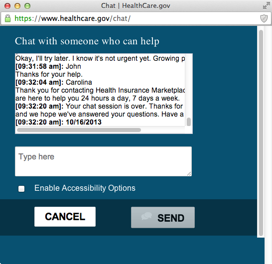
I experienced my own struggles with the site in October. By restricting the number of active users, the developers have prevented most of the crashing and molasses-like slowness that plagued the portal in its infancy. The worst problems seem to have been solved; I haven’t seen any disconnections or half-loaded pages this time around, and although filling out an entirely new application was necessary, I did finally get to view an eligibility report. Even better, the report was ready within seconds of submitting my new application.

Indeed, removing my “problem application” is one tool that is promoted in a Tuesday blog entry on the site. Other new features include “More robust window shopping,” allowing a quick glance at available plans, and online continuation of applications begun over the phone or with paper forms, using an application identification number. Even these tools aren’t perfect – the window shopping shows full retail pricing without any subsidies for which one might be eligible and the problem application removal tool confusingly gives “Cancel” and “Reset” options in a pop-up confirmation box – but these are usability issues rather than basic functionality.

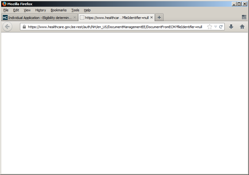
Usability is important, though. Optimizing the user experience (UX) is common practice – though, admittedly, often neglected – in software development. Establishing “Remove” or “Reset” as the term for tossing a previous application in the trash and using that term consistently helps ease users through a complex process. Choosing health insurance has never been a piece of cake, so care really should be taken to avoid introducing anything that makes you go “Huh?” Take this little step in the application:

Tell us if you're getting help

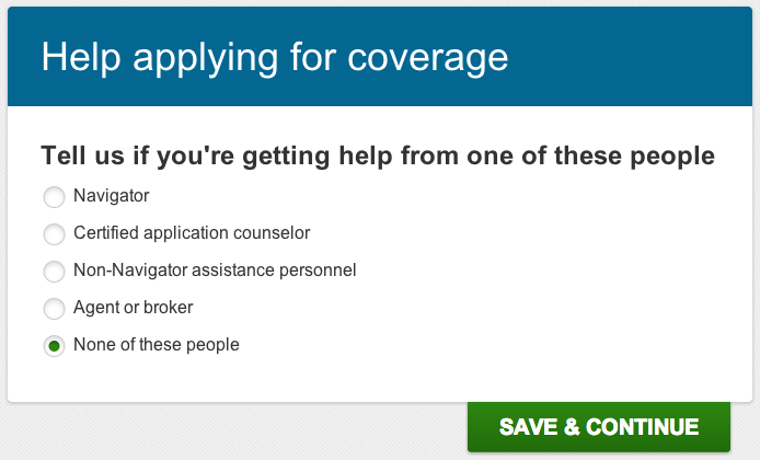
Simple enough, right? The lack of punctuation is mildly upsetting, but most people probably aren’t bothered by that. When the very next step contradicts my selection, though, that’s a problem.

You've told us another person

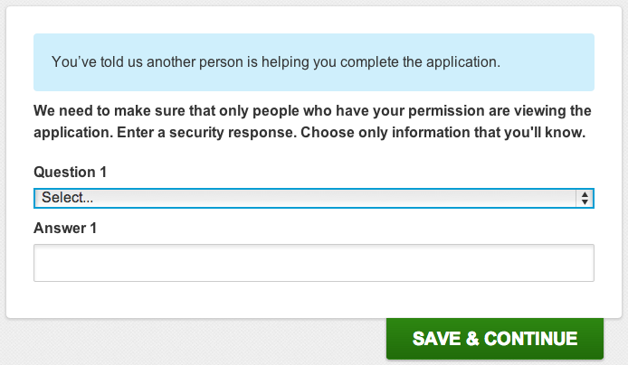
What? No. That’s not what I told you at all. I … okay, reading the previous step again, I realize I was never given the option to say that NO ONE is helping me, just none of the specific people you mentioned. So it’s possible to interpret that statement in blue as being correct. Sort of. Technically.

from a certain point of view

From a certain point of view.

A more grievous issue came in the “Review & Submit” portion of the application. If I chose to edit one piece of information I’d entered, I had to click through every subsequent screen again. No quick adjustment of one little thing, no sir. At least all the information was still there and I didn’t have to fill it out another time.

All the niggling little quirks point to a project that just didn’t take UX details seriously enough. Performing triage on site performance was unquestionably more important than correcting grammar, and hardly any major software or web site is perfect in that regard, but I do hope clarity and consistency are refined as further improvements are made.

Have you used HealthCare.gov? What has been your experience?

When Did Wi-Fi Get So Difficult?

Wi-Fi sadface

It all started with a misbehaving wireless connection. Every now and then, I was told, the connection would just drop and resume a few minutes later. A couple firmware updates and date/time adjustments later, the router still wouldn’t provide consistent signal. Fair enough; it was so old that it didn’t even have “2013” as an option in its “Year” dropdown menu. Time for a new router!

Unfortunately, new hardware came with new problems: rather than cutting out unexpectedly, this router just wouldn’t connect with one particular laptop. Its maddeningly simplistic setup instructions worked, sort of, on a convenient smartphone, but the only thing that got the laptop connected was totally disabling all security on the router, and that wasn’t a permanent option. Back to the store it went.

You might notice that the brand and model of the offending router were not disclosed in the previous paragraph. That’s because it was not, in the end, at fault. Oops.

For the next router setup, I wanted to be prepared. Was the problem the laptop? Was it the router? Was it a localized distortion in the space-time continuum? The answer would come with more data, and more data would come with more devices.

routers

What every bookcase should look like.

The final inventory was something like this:

  • Three Windows laptops
  • One MacBook Air
  • Two Android smartphones
  • One Android tablet
  • One iPad
  • One Nintendo DSi
  • One Roku
  • Four wireless routers
laptops

Later I had a cookie. It was the best day ever.

By connecting and disconnecting each device to various routers, I came to the inescapable conclusion: that one laptop was messed up. I’d previously changed its wireless driver to one available on the manufacturer’s site, but a newer one was available through Windows Update. That, and also possibly upgrading Internet Explorer from version 7 to version 9, finally got the thing connected.

(For all you browser evangelists out there, IE wasn’t current because it was never used. Logically it shouldn’t make a difference to the network connection itself what version of a browser is installed, but we all know how deeply IE hooks into the Windows operating system.)

Any home networking horror stories to share?

Nearly Half of Stores with Black Friday Sales Refuse to Take My Money on Thanksgiving

As a fully indoctrinated member of consumer society (marketing ID# C86HCBA9D2GH), it’s my gleeful duty every year to participate in Black Friday. This glorious event is characterized by hordes of shoppers flitting between retail stores hours before anyone has any business being awake on a freezing November morning with the slim hope of giving money to giant corporations in exchange for slightly better products than that amount might ordinarily buy.

Black Friday someecard

Everyone has their price, someecard user. Wait ’til they figure out how to sell snark and irony in bottles, and then discount that.

A popular, though incorrect, explanation for the origin of the name “Black Friday” claims that it is the day of the year on which retailers finally start earning a profit, using black instead of red ink in their ledgers. The competition for business that day is fierce, because the troublesome holiday of Thanksgiving is at last behind Americans and they begin vigorous Christmas shopping. Capturing shoppers that first day has required an escalating crush of discounts, advertising, and incentives to visit one store over another.

One incentive is opening time. The earlier a store can open, the thinking goes, the more eager shoppers it can attract. Normal 10:00 am, 9:00 am, 8:00 am openings are discarded; 7:00 am is a late start, 6:00 am is for the lightweights, 5:00 am marks the the true faithful, and 4:00 am, normally reserved for amateur astronomers and regretful lovers, is prime time. In recent years some stores even began opening at midnight.

Rockwell-freedom from want

If there’s no game console inside that turkey what is it doing in front of those kids?

The brinkmanship has only increased with the latest gambit. If folks are staying up until midnight just to technically shop on a day that isn’t a federal holiday, wouldn’t it be more humane to get over the stigma of “interrupting family time” “leaving just one freaking day free of commercialism” and and open at, say, 10:00 pm Thursday?

Extend that reasoning, and you have the current situation: more stores beginning sales on Thanksgiving Day than on Black Friday. Some open all day.

Now, granted, some of those stores are online only; it just takes electricity to accept your order. Shipment might not happen for hours. For genuine gratification of your antihistamine gift-giving needs first thing Thanksgiving morning, visiting a Walgreens or CVS is necessary. Meanwhile, across the street, Rite Aid makes you stand outside for another 23 hours while its employees selfishly sit around dinner tables.

This year, forsake your families. Forgo the feasting, conversation, and expressions of gratitude. After all, what use is giving thanks if we don’t rapaciously pursue the stuff we want? Support the retailers who enable the true pastime of our nation, every day of the year: SHOPPING.

What Do Facebook Fads Say About Us?

It’s likely that I don’t see all the same fads pop up on Facebook as everyone else; such is the nature of personalized content. But a few have broken through in recent weeks to become genuine hits, and with the exception of an extremely stupid giraffe thing that doesn’t know how plurals work, they all have one thing in common: they’re about you.

Bitstrips

Consumer electronics do not enjoy being juggled, apparently.

Consumer electronics do not seem to enjoy being juggled for some reason.

The most complex and visually-oriented of the recent fads, Bitstrips places you and your friends in allegedly comic situations. There are plenty of pre-made hilarious hijinks into which you can insert yourself, but the amount of customization available is pretty impressive. It took a good twenty minutes to construct my avatar, picking eyebrow shapes and skin tones and clothing. A photo-scanning algorithm was presumably beyond the developers, or they just thought that users would enjoy inspecting their own faces in order to create a reasonable simulacrum.

Your character’s body and facial expressions, along with one or two other situational details, can be manipulated within each cartoon. Presumably the real fun starts when you force your friends, also using the Bitstrips app, into compromising positions. I wouldn’t know.

Using Bitstrips on Facebook requires you to “Like” an app and give it permission to post on your behalf. There are also Android and iOS apps.

What Would I Say?

What Would I Say example

Obviously.

The What Would I Say web application started life as a quick project at a Princeton hackathon, but went viral so quickly that my ISP couldn’t even find the site by the time its took over my news feed. (See, domain names, the .com things typed into browsers or clicked via hyperlinks, really point to numerical IP addresses and ports and hosting providers, and it takes a bit of time for the whole Internet to be told about new ones. Note to Comcast: update your DNS servers more frequently. That’s kind of embarrassing.)

The app scoops up a portion of your Facebook posting history, slices and dices it into pieces, and then more or less randomly re-combines those pieces. This process results in mostly nonsensical pronouncements that use words and phrases you’ve used in the past, but with no regard for grammar, punctuation, or meaning. It’s a dumb little bot saying dumb little things that occasionally produces stunning poetic truths. It might or might not reveal what you actually think about any given subject.

What Would I Say claims it never sees or saves your posts, and that everything is done “client side” in your browser. It can also remix “celebrity” posts, meaning anyone with a Facebook Page (rather than just a regular profile).

X Things About Me You Might Not Know

With no supporting app, this status update template could just as easily be a chain letter. You get a number from a friend and you have to write that many little-known factoids about yourself. You can then demand that friends who Like your revelatory list do the same, with a number you provide.

Me, Me, Me

All these fads tap into the core feature of social media: users talking about themselves, while explicitly or implicitly inviting friends to talk about themselves. The methods use more or less computerized assistance to enable our collective narcissism or introspection, but ultimately come down to the fact that we’re all pretty interested in our own stories. Are our friends as interested? Depends on the friends and the stories.

Do you participate in fads like these? Do you find them annoying? Are you confused or relieved I didn’t call them “memes”? Let’s talk about ourselves a bit.

The Terrible, Awful, Calamitous, Democracy-Crushing Obamacare Website Rollout

Obama facepalm

Yesterday, President Obama acknowledged that HealthCare.gov stinks.

Not in so many words, of course. He said the site is “not working as well as it should,” according to CNN. His speech followed a blog post on the Health & Human Services site on Sunday saying pretty much the same thing and detailing the work going into fixing it.

For supporters of the Patient Protection and Affordable Care Act – known colloquially as Obamacare first by detractors but later reclaimed by the President himself – the website rollout has been embarrassing. No, as Slate points out, a broken site doesn’t invalidate liberalism itself, but it does hand a free talking point to conservatives who claim that government can’t do anything right.

HealthCare.gov woman

Any publicity is good publicity for stock photo models. She’ll land on her feet.

And yet, halfway through signing up for my own account last week, the process seemed to be going smoothly. Sure, the confirmation email to my Yahoo! account was shuffled into my spam folder, and even though the federal government surely has enough foresight and clout to suggest that email providers don’t block its addresses, ultimately that’s Yahoo!’s fault. Easily forgiven.

Sending me to a blank page instead of a promised eligibility report? That’s a little harder to swallow.

HealthCare.gov null

Most browsers didn’t even get this far. Go open source!

A friendly customer service agent did try to help me over live chat, but didn’t inspire much confidence. She was able to walk me through turning off pop-up blockers in several browsers, but since the chat itself was happening in a pop-up window, I was pretty certain that wasn’t the issue.

HealthCare.gov chat window

PROTIP: Pop-up windows and text boxes are allowed to be wide enough for the content they hold.

So my curiosity about health insurance options will have to wait. There’s been plenty of pontificating about how the tech sector would have supposedly done better setting up a portal like this. Like most big projects, the construction of HealthCare.gov was in fact contracted to an outside firm, but it still had to adhere to guidelines set up in the Affordable Care Act; there was no freedom to implement what worked first and innovate later.

There were undoubtedly unique challenges with such a large project and hard deadline. Still, many of the problems come down to sheer sloppiness.

HealthCare.gov error message

PROTIP #2: Learn periods. And tenses.

It’s months before the individual mandate to have health insurance goes into effect. In the meantime, HealthCare.gov is getting fixed, and anyone can still apply by phone. Would I pick the federal government to design my startup’s website? No. But a stuttering unveiling does not a policy failure make. By incorporating user feedback and perhaps hiring some new developers, HealthCare.gov can still be useful.