Hyperbolic Headlines are Worse than Hitler

TL;DR – Kids these days suck at journalism.

It’s no secret that Internet headlines are sliding toward “clickbait” – surprising, flashy, sexy phrases promising mind-blowing facts or crazy stories. That’s what headlines are for, right? To attract interest?

Sure. Then there are the ones that just lie.

Read more of this post

Mobile Apps, Gadgets, and Things Not Said in 2013

2013

Tired of all those “news” stories looking back at the year gone by? Hope not, because here are some more.

Mobile app development is the biggest of several services at my generous and benevolent employer. We noticed a few things more and more customers were asking for, and put together the thoroughly unscientific “Four Important App Development Trends of 2013“:

In the year 2013, the mobile technology sector has grown immensely. More people than ever own smartphones, and just by September, tablet sales soared 83 percent. Most of the technology trends Gartner compiled involved mobile as well, including HTML 5 / hybrid app development, enterprise app stores, cloud computing, and big data.

In all fairness, though my name is on the piece, a number of people contributed their thoughts and compiled interviews with our developers.

I’ve also begun contributing to The Hippo again after a self-imposed sabbatical. After a Techie gift guide two weeks ago, they asked me for a Techie year in review. So I gave it to ’em, I tell you what:

This has not been a year of dramatic revolution in the tech world, despite what every product launch might want us to believe. Rather, it was a year of logical progressions and advancements, with a few hints of what’s to come.

Yes yes, fingerprint scanner, SnapChat $3 billion, whatever. Humbug. Thirteenth straight year of the twenty-first century with no commercially available flying car.

Terrafugia Transition

“Reserve Now” doesn’t count, you wacky mechanical seagull.

There were also plenty of stories I started to write about, but flaked out on for one reason or another. Usually it was just lack of time or other priorities, but for one in particular I hemmed and hawed over the right wording until the story had faded from the news cycle.

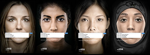
In October, a provocative series of ads was unveiled by UN Women, the United Nations Entity for Gender Equality and the Empowerment of Women. The ads depicted the faces of women with the Google search box superimposed over their mouths; under entered text  like “women should” and “women need to” were autocompleted phrases suggested by Google, such as “women should be slaves” and “women need to be put in their place“. The title of UN Women’s news release was, “UN Women ad series reveals widespread sexism“.

UN Women ads

I wasn’t convinced, and started composing an entry with the cheeky title, “Women Should Take the Google Autocomplete UN Ad With a (Small) Grain of Salt”. I noted that Google’s help page on Autocomplete isn’t very specific on how it works, saying that search queries and content on web pages influence the suggestions “algorithmically”.

I drafted up a spreadsheet showing the number of results for the Autocomplete suggestions as well as the rebuttal phrases on the UN posters, as of two days after the story broke:

Women should

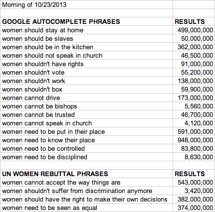
The numbers of results were all over the map, from a few million pages to nearly a billion for one set of words. The “cannot” rebuttal phrase had more results than all four of Google’s suggestions combined; whether they existed before or only after the ad series was publicized, I don’t know. My point, as much as one existed, was that Autocomplete results are not great evidence of sexism. As the most cogent portion of my draft blog entry said:

It’s also important to note that the mere mention of a phrase (or its constituent words) does not imply agreement. A matching Google result might be a piece expressing outrage at or arguing against an opinion expressed in a search. Indeed, one prominent person saying something objectionable often spawns thousands of articles spotlighting the incident.

For example, the number one result for “women should stay at home” was an AmericaBlog story lambasting Fox News for expressing that opinion. The next was a similar critique of a Catholic cardinal saying the same thing. The third was a WebMD article asking, “Working Mom Vs. Stay-At-Home Mom: Which Works for You?”, a valid question for individuals to consider for themselves. It wasn’t until my sixth result that the concept of imposing the standard of women staying at home was phrased as even debatable.

Likewise, we have no idea what the intention was of Google users who entered that search phrase. It could have been misogynists looking for support or feminists looking for debunking resources.

All we can really conclude from this experiment – and perhaps this is no consolation – is that these combinations of words are prevalent on the Internet. The biases implied by these phrases, even if they’re not agreed with, are in the collective conversation online. An optimistic view might be that those biases are on record and being addressed rather than completely internalized, accepted, and ignored.

Worried that questioning the technical means used by the ad agency hired by UN Women would be taken as trying to deny that sexism exists, I never posted. Well, until now. Hate comments below, and happy new year.

HealthCare.gov Condition Upgraded to Guarded but Stable

The website for the Health Insurance Marketplace portion of the Patient Protection and Affordable Care Act, HealthCare.gov, has been receiving much-needed improvements since it was launched on October 1. A better experience was promised after November 30 – and for the most part, it’s been achieved.

For the most part.

Queued

I experienced my own struggles with the site in October. By restricting the number of active users, the developers have prevented most of the crashing and molasses-like slowness that plagued the portal in its infancy. The worst problems seem to have been solved; I haven’t seen any disconnections or half-loaded pages this time around, and although filling out an entirely new application was necessary, I did finally get to view an eligibility report. Even better, the report was ready within seconds of submitting my new application.

Indeed, removing my “problem application” is one tool that is promoted in a Tuesday blog entry on the site. Other new features include “More robust window shopping,” allowing a quick glance at available plans, and online continuation of applications begun over the phone or with paper forms, using an application identification number. Even these tools aren’t perfect – the window shopping shows full retail pricing without any subsidies for which one might be eligible and the problem application removal tool confusingly gives “Cancel” and “Reset” options in a pop-up confirmation box – but these are usability issues rather than basic functionality.

Usability is important, though. Optimizing the user experience (UX) is common practice – though, admittedly, often neglected – in software development. Establishing “Remove” or “Reset” as the term for tossing a previous application in the trash and using that term consistently helps ease users through a complex process. Choosing health insurance has never been a piece of cake, so care really should be taken to avoid introducing anything that makes you go “Huh?” Take this little step in the application:

Tell us if you're getting help

Simple enough, right? The lack of punctuation is mildly upsetting, but most people probably aren’t bothered by that. When the very next step contradicts my selection, though, that’s a problem.

You've told us another person

What? No. That’s not what I told you at all. I … okay, reading the previous step again, I realize I was never given the option to say that NO ONE is helping me, just none of the specific people you mentioned. So it’s possible to interpret that statement in blue as being correct. Sort of. Technically.

from a certain point of view

From a certain point of view.

A more grievous issue came in the “Review & Submit” portion of the application. If I chose to edit one piece of information I’d entered, I had to click through every subsequent screen again. No quick adjustment of one little thing, no sir. At least all the information was still there and I didn’t have to fill it out another time.

All the niggling little quirks point to a project that just didn’t take UX details seriously enough. Performing triage on site performance was unquestionably more important than correcting grammar, and hardly any major software or web site is perfect in that regard, but I do hope clarity and consistency are refined as further improvements are made.

Have you used HealthCare.gov? What has been your experience?

What Do Facebook Fads Say About Us?

It’s likely that I don’t see all the same fads pop up on Facebook as everyone else; such is the nature of personalized content. But a few have broken through in recent weeks to become genuine hits, and with the exception of an extremely stupid giraffe thing that doesn’t know how plurals work, they all have one thing in common: they’re about you.

Bitstrips

Consumer electronics do not enjoy being juggled, apparently.

Consumer electronics do not seem to enjoy being juggled for some reason.

The most complex and visually-oriented of the recent fads, Bitstrips places you and your friends in allegedly comic situations. There are plenty of pre-made hilarious hijinks into which you can insert yourself, but the amount of customization available is pretty impressive. It took a good twenty minutes to construct my avatar, picking eyebrow shapes and skin tones and clothing. A photo-scanning algorithm was presumably beyond the developers, or they just thought that users would enjoy inspecting their own faces in order to create a reasonable simulacrum.

Your character’s body and facial expressions, along with one or two other situational details, can be manipulated within each cartoon. Presumably the real fun starts when you force your friends, also using the Bitstrips app, into compromising positions. I wouldn’t know.

Using Bitstrips on Facebook requires you to “Like” an app and give it permission to post on your behalf. There are also Android and iOS apps.

What Would I Say?

What Would I Say example

Obviously.

The What Would I Say web application started life as a quick project at a Princeton hackathon, but went viral so quickly that my ISP couldn’t even find the site by the time its took over my news feed. (See, domain names, the .com things typed into browsers or clicked via hyperlinks, really point to numerical IP addresses and ports and hosting providers, and it takes a bit of time for the whole Internet to be told about new ones. Note to Comcast: update your DNS servers more frequently. That’s kind of embarrassing.)

The app scoops up a portion of your Facebook posting history, slices and dices it into pieces, and then more or less randomly re-combines those pieces. This process results in mostly nonsensical pronouncements that use words and phrases you’ve used in the past, but with no regard for grammar, punctuation, or meaning. It’s a dumb little bot saying dumb little things that occasionally produces stunning poetic truths. It might or might not reveal what you actually think about any given subject.

What Would I Say claims it never sees or saves your posts, and that everything is done “client side” in your browser. It can also remix “celebrity” posts, meaning anyone with a Facebook Page (rather than just a regular profile).

X Things About Me You Might Not Know

With no supporting app, this status update template could just as easily be a chain letter. You get a number from a friend and you have to write that many little-known factoids about yourself. You can then demand that friends who Like your revelatory list do the same, with a number you provide.

Me, Me, Me

All these fads tap into the core feature of social media: users talking about themselves, while explicitly or implicitly inviting friends to talk about themselves. The methods use more or less computerized assistance to enable our collective narcissism or introspection, but ultimately come down to the fact that we’re all pretty interested in our own stories. Are our friends as interested? Depends on the friends and the stories.

Do you participate in fads like these? Do you find them annoying? Are you confused or relieved I didn’t call them “memes”? Let’s talk about ourselves a bit.

The Terrible, Awful, Calamitous, Democracy-Crushing Obamacare Website Rollout

Obama facepalm

Yesterday, President Obama acknowledged that HealthCare.gov stinks.

Not in so many words, of course. He said the site is “not working as well as it should,” according to CNN. His speech followed a blog post on the Health & Human Services site on Sunday saying pretty much the same thing and detailing the work going into fixing it.

For supporters of the Patient Protection and Affordable Care Act – known colloquially as Obamacare first by detractors but later reclaimed by the President himself – the website rollout has been embarrassing. No, as Slate points out, a broken site doesn’t invalidate liberalism itself, but it does hand a free talking point to conservatives who claim that government can’t do anything right.

HealthCare.gov woman

Any publicity is good publicity for stock photo models. She’ll land on her feet.

And yet, halfway through signing up for my own account last week, the process seemed to be going smoothly. Sure, the confirmation email to my Yahoo! account was shuffled into my spam folder, and even though the federal government surely has enough foresight and clout to suggest that email providers don’t block its addresses, ultimately that’s Yahoo!’s fault. Easily forgiven.

Sending me to a blank page instead of a promised eligibility report? That’s a little harder to swallow.

HealthCare.gov null

Most browsers didn’t even get this far. Go open source!

A friendly customer service agent did try to help me over live chat, but didn’t inspire much confidence. She was able to walk me through turning off pop-up blockers in several browsers, but since the chat itself was happening in a pop-up window, I was pretty certain that wasn’t the issue.

HealthCare.gov chat window

PROTIP: Pop-up windows and text boxes are allowed to be wide enough for the content they hold.

So my curiosity about health insurance options will have to wait. There’s been plenty of pontificating about how the tech sector would have supposedly done better setting up a portal like this. Like most big projects, the construction of HealthCare.gov was in fact contracted to an outside firm, but it still had to adhere to guidelines set up in the Affordable Care Act; there was no freedom to implement what worked first and innovate later.

There were undoubtedly unique challenges with such a large project and hard deadline. Still, many of the problems come down to sheer sloppiness.

HealthCare.gov error message

PROTIP #2: Learn periods. And tenses.

It’s months before the individual mandate to have health insurance goes into effect. In the meantime, HealthCare.gov is getting fixed, and anyone can still apply by phone. Would I pick the federal government to design my startup’s website? No. But a stuttering unveiling does not a policy failure make. By incorporating user feedback and perhaps hiring some new developers, HealthCare.gov can still be useful.