HealthCare.gov Condition Upgraded to Guarded but Stable
December 5, 2013 Leave a Comment
The website for the Health Insurance Marketplace portion of the Patient Protection and Affordable Care Act, HealthCare.gov, has been receiving much-needed improvements since it was launched on October 1. A better experience was promised after November 30 – and for the most part, it’s been achieved.
For the most part.
I experienced my own struggles with the site in October. By restricting the number of active users, the developers have prevented most of the crashing and molasses-like slowness that plagued the portal in its infancy. The worst problems seem to have been solved; I haven’t seen any disconnections or half-loaded pages this time around, and although filling out an entirely new application was necessary, I did finally get to view an eligibility report. Even better, the report was ready within seconds of submitting my new application.
Indeed, removing my “problem application” is one tool that is promoted in a Tuesday blog entry on the site. Other new features include “More robust window shopping,” allowing a quick glance at available plans, and online continuation of applications begun over the phone or with paper forms, using an application identification number. Even these tools aren’t perfect – the window shopping shows full retail pricing without any subsidies for which one might be eligible and the problem application removal tool confusingly gives “Cancel” and “Reset” options in a pop-up confirmation box – but these are usability issues rather than basic functionality.
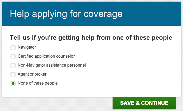
Usability is important, though. Optimizing the user experience (UX) is common practice – though, admittedly, often neglected – in software development. Establishing “Remove” or “Reset” as the term for tossing a previous application in the trash and using that term consistently helps ease users through a complex process. Choosing health insurance has never been a piece of cake, so care really should be taken to avoid introducing anything that makes you go “Huh?” Take this little step in the application:
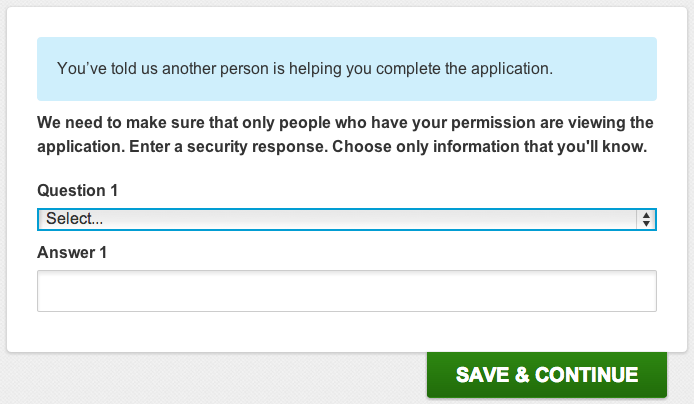
Simple enough, right? The lack of punctuation is mildly upsetting, but most people probably aren’t bothered by that. When the very next step contradicts my selection, though, that’s a problem.
What? No. That’s not what I told you at all. I … okay, reading the previous step again, I realize I was never given the option to say that NO ONE is helping me, just none of the specific people you mentioned. So it’s possible to interpret that statement in blue as being correct. Sort of. Technically.
A more grievous issue came in the “Review & Submit” portion of the application. If I chose to edit one piece of information I’d entered, I had to click through every subsequent screen again. No quick adjustment of one little thing, no sir. At least all the information was still there and I didn’t have to fill it out another time.
All the niggling little quirks point to a project that just didn’t take UX details seriously enough. Performing triage on site performance was unquestionably more important than correcting grammar, and hardly any major software or web site is perfect in that regard, but I do hope clarity and consistency are refined as further improvements are made.
Have you used HealthCare.gov? What has been your experience?


